Production environments that utilize modern quality control methods are dependant upon statistical literacy. The tools used therein are called the seven quality control tools. These include:
Checksheet


Pareto Chart
Flow Chart

Cause and Effect Diagram
Histogram

Scatter Diagram
Control Chart
The function of a checksheet is to present information in an efficient, graphical format. This may be accomplished with a simple listing of items. However, the utility of the checksheet may be significantly enhanced, in some instances, by incorporating a depiction of the system under analysis into the form.
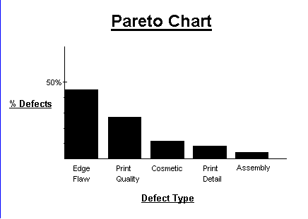
Pareto charts are extremely useful because they can be used to identify those factors that have the greatest cumulative effect on the system, and thus screen out the less significant factors in an analysis. Ideally, this allows the user to focus attention on a few important factors in a process.
They are created by plotting the cumulative frequencies of the relative frequency data (event count data), in decending order. When this is done, the most essential factors for the analysis are graphically apparent, and in an orderly format.
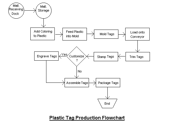
Flowcharts are pictorial representations of a process. By breaking the process down into its constituent steps, flowcharts can be useful in identifying where errors are likely to be found in the system.
This diagram, also called an Ishikawa diagram (or fish bone diagram), is used to associate multiple possible causes with a single effect. Thus, given a particular effect, the diagram is constructed to identify and organize possible causes for it.
The primary branch represents the effect (the quality characteristic that is intended to be improved and controlled) and is typically labelled on the right side of the diagram. Each major branch of the diagram corresponds to a major cause (or class of causes) that directly relates to the effect. Minor branches correspond to more detailed causal factors. This type of diagram is useful in any analysis, as it illustrates the relationship between cause and effect in a rational manner.
Histograms provide a simple, graphical view of accumulated data, including its dispersion and central tendancy. In addition to the ease with which they can be constructed, histograms provide the easiest way to evaluate the distribution of data.
Scatter diagrams are graphical tools that attempt to depict the influence that one variable has on another. A common diagram of this type usually displays points representing the observed value of one variable corresponding to the value of another variable.
The control chart is the fundamental tool of statistical process control, as it indicates the range of variability that is built into a system (known as common cause variation). Thus, it helps determine whether or not a process is operating consistently or if a special cause has occurred to change the process mean or variance.
The bounds of the control chart are marked by upper and lower control limits that are calculated by applying statistical formulas to data from the process. Data points that fall outside these bounds represent variations due to special causes, which can typically be found and eliminated. On the other hand, improvements in common cause variation require fundamental changes in the process.
The tools listed above are ideally utilized in a particular methodology, which typically involves either reducing the process variability or identifying specific problems in the process. However, other methodologies may need to be developed to allow for sufficient customization to a certain specific process. In any case, the tools should be utilized to ensure that all attempts at process improvement include:
Furthermore, it is important to note that the mere use of the quality control tools does not necessarily constitute a quality program. Thus, to achieve lasting improvements in quality, it is essential to establish a system that will continuously promote quality in all aspects of its operation.
Additional data collection checksheet examples demonstrate the utility of this tool. The data collected will be used in subsequent examples to demonstrate how the individual tools are often interconnected.